|
I have worked at the same job since 1975, although the employer has changed
three or four times and the duties have changed many more times than that.
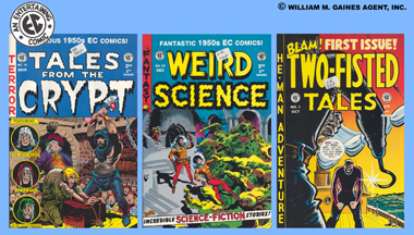
Currently, I work (chiefly) in production on the magazine COMIC BOOK MARKETPLACE,
which is a feature magazine devoted to older comic books and newspaper strips and related material, and the collection of
them. Somewhere around here is the front cover of a recent issue, which I put together from supplied elements.
NOTE: This
title ceased publication in (I think) early 2005.
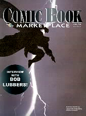
| Issue 90, version C |
|
| art (c) DC Comics, Inc. |
We worked from a a supplied image of a Batman trade paperback. When I added our logo and a round
blurb I pretended they were affected by the lightning flash. It may not be clear in this repro that the silhouette of Batman
is not solid black, but a grainy black-brown. Why that is, I do not know. Some people wondered why I didn't "fix" it to be
solid black. This would have required my making a decision that perhaps over-rode an original element of the art. It actually
helps set off the figure on an otherwise deep black cover, so I was happy. Sometimes my choice of color schemes is too subtle,
but in this case it worked.
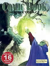
| Issue 94, version B |
|
| art (c) DC Comics, Inc. |
On this one, again a DC Comics piece, I was supplied a weirdly proportioned
file that was tall for its width. The perfect crop at a safe scaling would have obscured the face of the big monster (Solomon
Grundy) with the mag logo; I submitted a prelim of that solution and hoped Solomon's face was not critical. It was returned
with instructions to not hide Solomon's face. That required enlarging the image beyond what was wise, but the ethereal light-filled
look of the piece made that fact less noticeable. I over-did picking up colors from the art to use in the logo; it's pretty
but too subtle for newsstand display really. Live and learn.
|